
The Optophono logo (above) was designed by Ryan O'Reilly, the enormously talented designer behind Rinky Design. The 'O' in Optophono hints at an eye (as in opto/optical), while the 'P' hints at an ear (as in phono/audial).
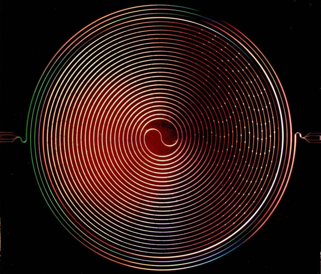
Our design was inspired by this: a cosmic amplifier by NASA. An actual cosmic amplifier!
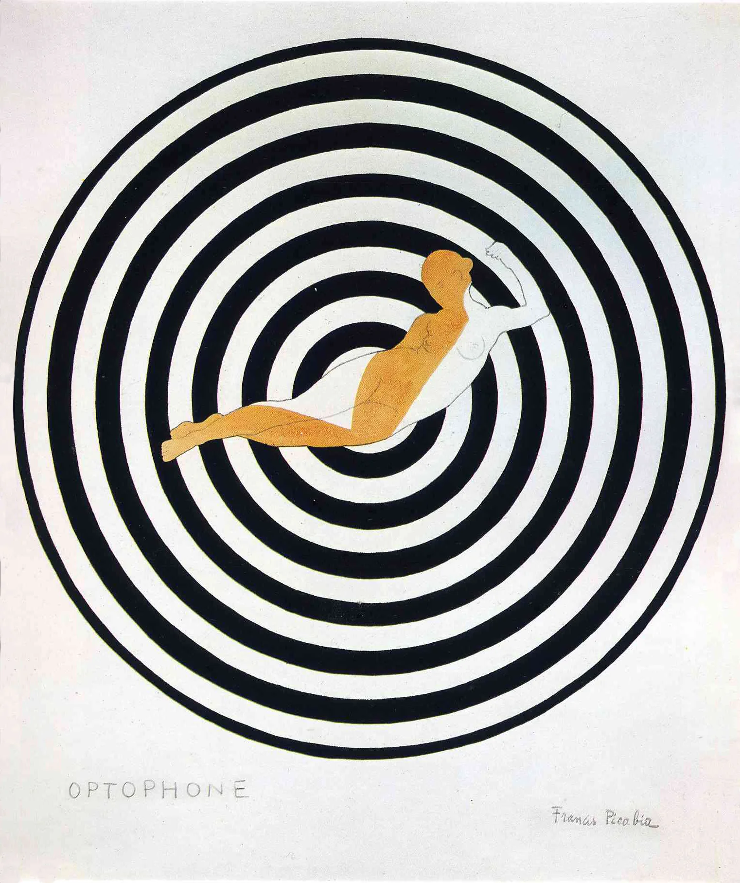
After completing our logo design and publishing our first edition we discovered this: a print entitled 'Optophone I' by Francis Picabia, from 1922. Coincidence? Or kismet?